话不多说,直接开始~
1. vertical-align属性
vertical-align定义的是周围元素相对于当前元素的对齐方式
属性有:
下图为bottom对齐

下图为baseline对齐:
下图为middle对齐:
vertical-align属性对于inline元素、inline-block元素和table-cell元素有效,对块元素无效。
同时,对于div中的img来说,若为div添加边框的话,边框和img之间总会有白边,这是因为vertical-align的默认值为baseline,将其修改为bottom就可以了
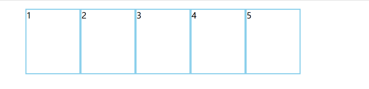
2. 溢出的文字设置为省略号
若你的文字放在p标签中,你需要在style中为p设置如下属性:
1
2
3
| white-space: nowrap; /* 让文字一行内显示 */
overflow: hidden;
text-overflow: ellipsis; /* 溢出的部分用省略号表示 */
|
3. margin负值的应用
可以先对比一下下面两幅图:
如何使得ul的li之间边框重叠时不会变粗呢?
我们可以使用margin!
要记得先为每个li设置float为left,然后为其margin设置为负值,就ok啦~
但是,如果你想为每个li设置一个hover后更换边框颜色的动画,你会发现每个li的右边框无法显示更换后的颜色,这是因为这个li右面的li压在了它上方。该怎么解决呢?
解决的方法有两种:
1.如果li没有position定位,为其设置position:relative
2.如果存在定位,则更改当前li的z-index为1(不一定是1 ,需要高于其他li)
这样就可以解决啦!
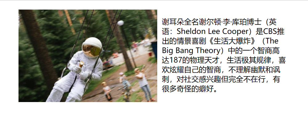
4. 文字环绕图片
这个效果其实很简单,如图:
(图文不搭)
这种效果,只要将图片设置为float:left就可以了,因为图片不会压在文字上方,但要调整为比较好看的布局的话,还需要在margin、padding上下一点点功夫,附上代码:
1
2
3
4
5
6
7
8
9
10
11
12
13
14
15
16
17
18
19
20
21
22
23
24
25
26
27
28
29
30
31
32
33
34
35
36
37
38
39
| <!DOCTYPE html>
<html lang="en">
<head>
<meta charset="UTF-8">
<meta http-equiv="X-UA-Compatible" content="IE=edge">
<meta name="viewport" content="width=device-width, initial-scale=1.0">
<title>Document</title>
<style>
*{
margin:0;
padding: 0;
}
.nav{
width: 600px;
height: 200px;
padding: 20px;
}
.nav img{
width: 300px;
height: 200px;
float: left;
margin-right: 10px;
margin-left:20px;
}
.nav p{
margin-top: 15px;
}
</style>
</head>
<body>
<div class="nav">
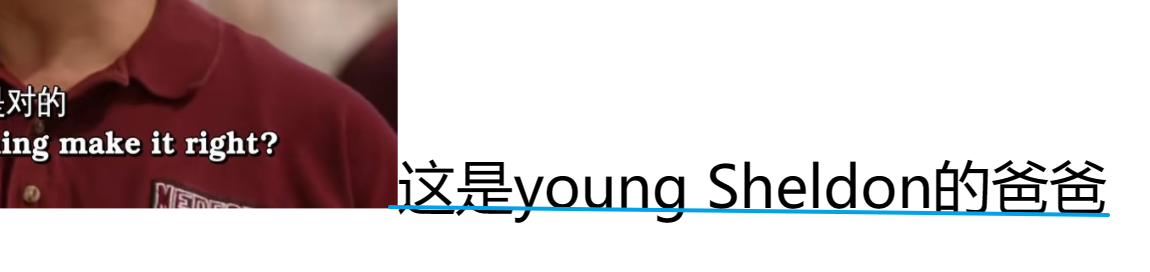
<img src="../JS code/img/robot.jpg" alt="">
<p>谢耳朵全名谢尔顿·李·库珀博士(英语:Sheldon Lee Cooper)是CBS推出的情景喜剧《生活大爆炸》(The Big Bang Theory)中的一个智商高达187的物理天才,生活极其规律,喜欢炫耀自己的智商,不理解幽默和讽刺,对社交感兴趣但完全不在行,有很多奇怪的癖好。</p>
</div>
</body>
</html>
|
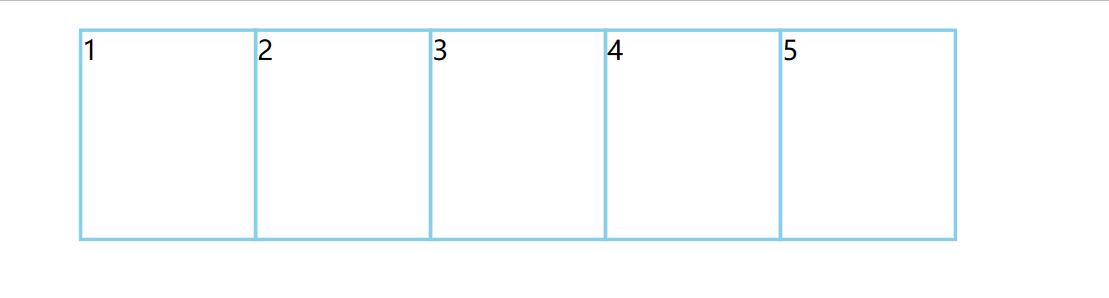
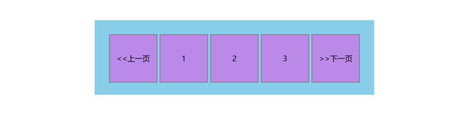
5. 行内块元素的应用
如图,这是我们比较常见的页数格,可能大家会想到用ul和li制作,这样是可行的,但是还存在一种更为简便的方法,就是利用行内块元素的特性,他们之间存在一定间隔,且很方便就可以使其居中对齐(为其父盒子设置text-align:center)
附上代码:
1
2
3
4
5
6
7
8
9
10
11
12
13
14
15
16
17
18
19
20
21
22
23
24
25
26
27
28
29
30
31
32
33
34
35
36
37
38
39
40
41
42
43
| <!DOCTYPE html>
<html lang="en">
<head>
<meta charset="UTF-8">
<meta http-equiv="X-UA-Compatible" content="IE=edge">
<meta name="viewport" content="width=device-width, initial-scale=1.0">
<title>Document</title>
<style>
*{
margin:0;
padding: 0;
}
div{
width: 600px;
height: 160px;
background-color: skyblue;
margin:50px auto;
text-align: center;
}
div span{
width: 100px;
height: 100px;
display: inline-block;
background-color: rgba(213, 103, 233, 0.664);
margin-top: 30px;
line-height: 100px;
border: 2px solid rgba(128, 128, 128, 0.795);
cursor: pointer;
}
</style>
</head>
<body>
<div>
<span><<上一页</span>
<span>1</span>
<span>2</span>
<span>3</span>
<span>>>下一页</span>
</div>
</body>
</html>
|
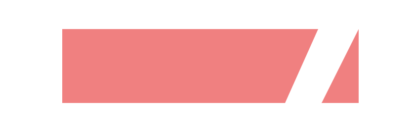
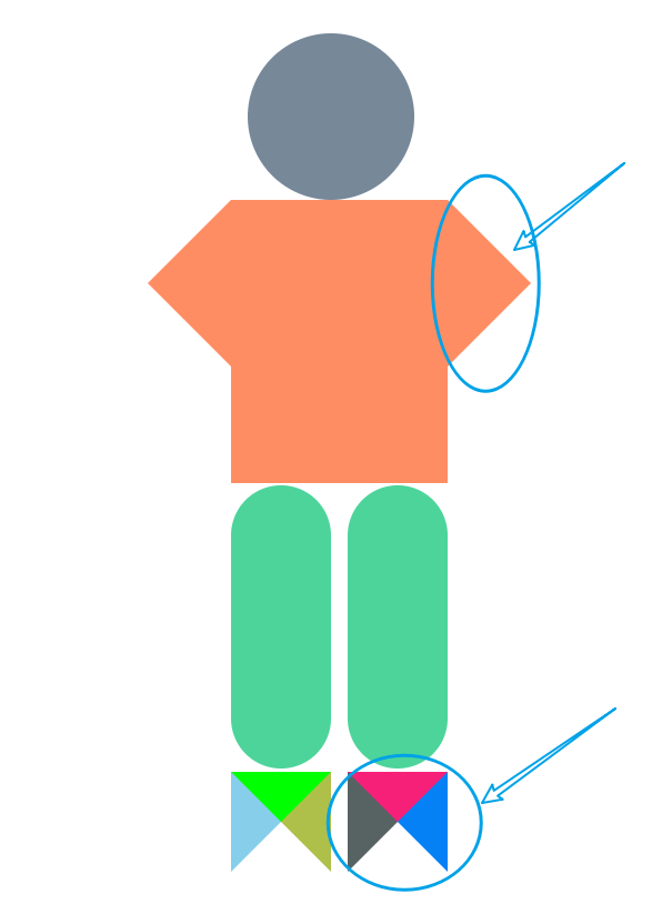
6. CSS三角的应用
什么叫做CSS三角呢?
就是如图所示的效果:
左面的盒子右边会有一个小三角形,右面的盒子本身就是一个小三角形
这种效果其实是靠border来做的
具体是这样的:
为一个盒子设置高度、宽度为0,再为其盒子设置border-top、border-right、border-bottom、border-left,可以自己多尝试几次,结合下面的例子,为不同的边设置不同的宽度等等。
其实border-top设置的是一个三角形,宽度为left+right设置的长度,高度为top本身设置的长度。
见下图(哈哈哈哈哈),箭头所指的地方都是拿border做的
附上代码:
1
2
3
4
5
6
7
8
9
10
11
12
13
14
15
16
17
18
19
20
21
22
23
24
25
26
27
28
29
30
31
32
33
34
35
36
37
38
39
40
41
42
43
44
45
46
47
48
49
50
51
52
53
54
55
56
57
58
59
60
61
62
63
64
65
66
67
68
69
70
71
72
73
74
75
76
77
78
79
80
81
82
83
84
85
86
87
88
89
90
91
92
93
94
95
96
97
98
99
100
101
102
| <!DOCTYPE html>
<html lang="en">
<head>
<meta charset="UTF-8">
<meta http-equiv="X-UA-Compatible" content="IE=edge">
<meta name="viewport" content="width=device-width, initial-scale=1.0">
<title>Document</title>
<style>
*{
margin:0;
padding: 0;
}
.to{
margin:30px auto;
width: 500px;
position: relative;
}
.hd{
width: 100px;
height: 100px;
border-radius: 50%;
background-color: lightslategrey;
position: relative;
left:110px;
}
.box,.tem {
width: 0;
height: 0;
border-top: 50px transparent solid;
border-left: 50px rgba(255, 127, 80, 0.892) solid;
border-right: 50px transparent solid;
border-bottom: 50px transparent solid;
position: absolute;
left:230px;
}
#nav {
width: 130px;
height: 170px;
position: absolute;
left:100px;
background-color: rgba(255, 127, 80, 0.892);
text-align: center;
font-size: 18px;
color:rgb(43, 20, 247);
}
.tem{
border-right: 50px rgba(255, 127, 80, 0.892) solid;
border-left: 50px transparent solid;
left:0;
}
.pant1,.pant2{
width: 60px;
height: 170px;
background-color:rgb(76, 212, 155);
position: absolute;
left:100px;
top:271px;
border-radius: 40px;
}
.pant2{
left:170px;
}
.shoe1,.shoe2{
width: 0;
height: 0;
border-top: 30px lime solid;
border-left: 30px skyblue solid;
border-right: 30px rgb(174, 192, 73) solid;
border-bottom: 30px transparent solid;
position: absolute;
top:443px;
left:100px;
}
.shoe2{
border-top: 30px rgb(247, 32, 121) solid;
border-left: 30px rgb(87, 98, 99) solid;
border-right: 30px rgb(5, 129, 245) solid;
border-bottom: 30px transparent solid;
left:170px;
}
</style>
</head>
<body>
<div class="to">
<div class="hd"></div>
<div id="nav"></div>
<div class="box"></div>
<div class="tem"></div>
<div class="pant1"></div>
<div class="pant2"></div>
<div class="shoe1"></div>
<div class="shoe2"></div>
</div>
</body>
</html>
|
下图的效果其实大同小异,在一个div中添加两个div,为其设置float:left,左边的就是长方形盒子,右边的就是拿border做出来的三角形,只不过需要将左边框、下边框宽度设置为0,右边框颜色设置为transparent
附上代码:
1
2
3
4
5
6
7
8
9
10
11
12
13
14
15
16
17
18
19
20
21
22
23
24
25
26
27
28
29
30
31
32
33
34
35
36
37
38
39
40
41
42
43
44
45
46
47
48
49
50
51
| <!DOCTYPE html>
<html lang="en">
<head>
<meta charset="UTF-8">
<meta http-equiv="X-UA-Compatible" content="IE=edge">
<meta name="viewport" content="width=device-width, initial-scale=1.0">
<title>Document</title>
<style>
* {
margin: 0;
padding: 0;
}
.tot {
width: 400px;
margin: 50px auto;
}
.nav {
width: 300px;
height: 100px;
background-color: lightcoral;
float: left;
}
.tem {
border-top: lightcoral 100px solid;
border-left: transparent 0 solid;
border-right: transparent 45px solid;
border-bottom: transparent 0 solid;
float: left;
}
.nxt{
border-color:transparent transparent lightcoral transparent ;
border-width: 0 0 100px 50px;
border-style: solid;
float: right;
}
</style>
</head>
<body>
<div class="tot">
<div class="nav"></div>
<div class="tem"></div>
<div class="nxt"></div>
</div>
</body>
</html>
|
其实还是需要自己多多尝试着去应用呀,今天的小技巧就介绍完啦